Landing Page Optimization Breakdown: When and How to Use
Every site should have at least one landing page. The purpose of a landing page is to provide follow-up information on a marketing or advertising campaign/goal. They are specific pages on your website with one distinct call to action, whether that is purchasing a specific product or signing up for newsletters.
There are plenty of different types of landing pages including lead generation, click-through pages, squeeze pages, sales pages, and microsites. When ad campaigns direct traffic to a certain link on the site, that landing page serves as the first page that all of the traffic from that ad sees. So, the call to action should be distinct to that ad.
What Are the Main Types of Landing Pages?
Not all landing pages are created with the same messaging or call to action. There are plenty of options to create landing pages for your site. Here are a few examples:
- Lead generation: Collect user information to establish potential customers or “leads” for your products/services.
- Click-through: The first page a user sees after clicking on an ad whose goal is to prep the user with precursor information that will help drive conversions on a further page
- Squeeze Page: Collect email addresses
- Sales Page: Convince users to buy your products or services
- Viral Page: A page used to promote word of mouth marketing
- Microsite: Serves similar to a summary of your site on a single page, where it will include branding, contact information, and business and product/service information. This page can be either on the brand’s website or on its own.
- Unsubscribe: Let users know when they have unsubscribed from the email list. This helps you comply with spam laws and gives you a last chance to collect information about why the user was disinterested.
- Thank You: Thank a user for signing up for your email list.
Best Landing Page Optimization Tools
Landing page optimization tools can help you each step of the way from design to analytics tracking. The most important landing page optimization tool you should always use is Google Analytics.
Google Analytics provides valuable insights into how your audience behaves on your site. You can analyze everything including referral sources, user behavior, demographics, and conversions based on referral source. This can help drive your decisions on how to improve your site and brand messaging.
Landing Page Metrics That Matter
Once you’ve set up Google Analytics, you will be able to track important information on user behavior for your site. The most important metrics to look at for landing pages are bounce rate, the amount of time spent on the page, the amount of traffic the landing page gets, and what source brought them to your landing page.
If you have a high bounce rate, you might need to redesign the page or check if there is something that doesn’t work on the page. On the other hand, a combination of low bounce rate and long amount of time spent on the page will show you that users are interested in your landing page. From there, you can narrow down what works well for brand messaging, visuals, and information on the page.
Tracking the source that brought them to your landing page is helpful when you have more than one ad or marketing funnel driving users to that page.
Which Attributes Describe a Good Landing Page Experience?
A good landing page experience will always provide users with enough information to convert. Some attributes that could be included on a landing page include:
- Distinct CTA
- FAQ
- Compelling copy
- Relevant and attractive visuals
- Great use of space
- Consistent branding
- Simplicity
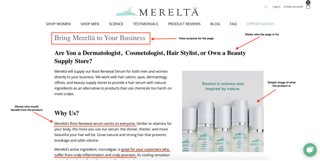
Often, the first thing users look at on a page are the visuals. Having aesthetically pleasing, on-brand, and relevant visuals enhance the brand’s messaging. Make sure your visuals are sized properly so as not to effect page speed.
Compelling copy drives users towards the CTA while providing enough information about the products/services/or goal of the landing page.
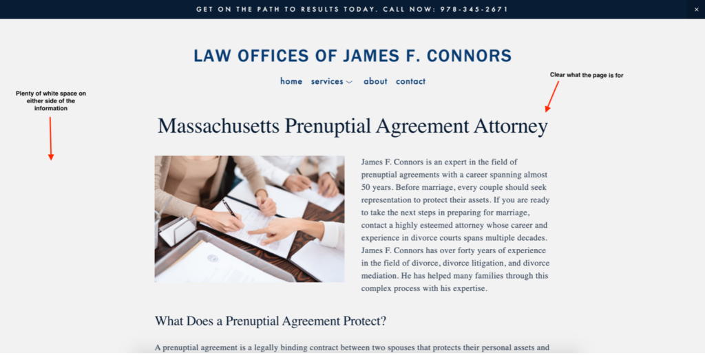
Use of space is another important attribute of a good landing page experience. Pages that are too busy will distract from the messaging and CTA. Minimalist design or a clear and concise layout draw users’ eyes where they need to be on the page.
Landing Page Design
Landing pages can all look entirely different depending on the company, CTA, and amount of information that needs to be on the page. Every landing page should match the company’s brand and the style of the website.
Landing page design should be focused with minimal scrolling. All important information should be clearly contained above the fold.
Product Specific Landing Pages
Product specific landing pages are used to direct traffic right to a certain product to drive higher conversions. Because the goal of this landing page is to buy a product, the CTA is always a button that allows customers to purchase or add to cart.
Good product specific landing pages will have information on the product, social proof, compelling copy, and a button to purchase the product.
How Do I Create a Landing Page?
If you are looking for a landing page and need help creating it, check out our landing page services or contact Ben at ben@risemkg.com.
